Colorful Glowing Text Effect in Photoshop ( Tutorial & Psd File )
 18:13
18:13
 hatizix

Step 1 – Choosing a Background
For the best results with this effect, you’ll want to use a dark background. The background should have a hint of color, and should avoid from being too dark (such as pure black). Being inspired from Drasik’s work, I’ll use a dark violet (#120612).
Just to get this out of the way, as you may notice throughout this tutorial, there are LOTS of different ways to go about accomplishing this effect – this is just the way I found to be most convenient.
Step 2 – Setting the Type
We’ll be setting the type in a not-so-traditional way, which will allow us to get a special layering.
Using the Type Tool, type whatever it is you’d like to apply the effect to, BUT only type one letter per layer. That is, you need to type a letter, apply the text, then create a new type layer with your next letter. When all is said and done, you should have a separate layer for each letter.
You’re image probably looks something like this (Quick Note: Type used below is Century Gothic):

Well, that leaves something to be left desired.
Rather than wasting too much time trying to get things aligned perfectly, let’s handle it all in a quick step. Select the Move Tool. Create a selection around the first letter (Ctrl + Click the Layer Thumbnail in the Layers Palette). Next, Select ALL of the Type Layers (Click the Bottom Type Layers name, hold shift, then click the top Type Layers name). Now, in the Options bar, Click “Align Bottom Edges” – the icon that looks like this 

Deselect everything (Ctrl + D), and now start moving your individual letters so that they slightly overlap one another.

Step 3 – Add a Gradient
Create a new Layer above your type layers. Using the Gradient Tool, and a White to Transparentgradient, fill in the work area so that the Gradient is not TOO OPAQUE, or TOO TRANSPARENT where it overlaps with the text, but fades nicely in that area. The gradient should move from top to bottom – Top being the most opaque (Hold Shift to make a perfectly straight gradient).

Step 4 – Cutting out Letters
Imagine that we’re making shaped-cookies. It’s a stretch, but stay with me. In a way, this gradient will serve as our ‘dough’, while the letters will be our ‘cookie cutters’. Those individual type layers created earlier are tools we can use to create shapes from the gradient.
Let’s go through it step by step and see if it makes more sense. Create a selection of the layer contents for your first letter (Ctrl + Click the Layer Thumbnail in the Layers Palette). Now, Select the Gradient Layer (By “Select”, I mean click the layer – do not select the layer contents. We want the selection of the first letter to remain). Copy (Ctrl + C) and Paste so that you’ve created a copy of the gradient in the shape of the letter. If you were to disable ALL of the layers except for this new layer you just created, and the background, you’d now have this:

It’s really a lot simpler than it sounds. Repeat this process for the rest of the letters, always making sure to selecting the gradient layer (the dough) prior to cutting out your layer. When you’re finished, put away all your letters and gradient layers (delete them, or hide them).

Step 5 – Just Add Color!
You may want to name all of your individual layers, that way you don’t lose track of which letter is which, but perhaps you’ve got a manageable number and that’s not necessary.
Create a new layer above all your ‘gradient-letters’. Grab the Paint Bucket Tool, and a bright color (I’m starting with #7fff5d). Create a selection of your first gradient-letter (Ignore any messages you may or may not see about no selection being shown), and fill in that selection with your selected color on the new layer. Set this layers Blending Mode to Screen.

Repeat this process for the remaining letters (each color on a new layer). Try using the same colors more than once every now and then.

Step 6 – Merge
When you’re sure that the type is set correctly, Merge all of your gradient-letters (Select the layers, then Ctrl + E). Then, Merge all of your colors into one layer (Make sure the blending mode is still set to screen).
You should now have two layers – one with the plain gradient layers, the other with the colors for the letters. We didn’t have to do this, it’s just easier to manage.
Step 7 – Getting the Glow
Duplicate your gradient-letters layer (Not the color layer). Apply a Gaussian Blur (See our Filters Tutorial) with value of 1-3 on this layer.

Repeat this step (Duplicate & Blur) on your Color layer. Set this layer to Lighten or Screen (use best judgment). Depending on the saturation and intensity of your colors, you may choose to duplicate the color layer a second time.

Step 8
Using the Eraser Tool, and a soft brush, go back and erase parts of the colored layers so that the type appears to fade from color to a ghostly white.

Step 9 – Reflect
Select ALL of the layers being used for the text effect, then Duplicate them. Merge the duplicated version into one layer. Use the trendy Surface Reflection Technique shown in our 5 Essential Reflections for Photoshop Tutorial to mirror your type.

Step 10 – Adjust as Needed!
From here on out, I’ll let you play on your own with the effect. I’d recommend playing with lighting effects in the background — simple things like adding some highlights behind the text… though you certainly could go all out as Drasik does in his work!
Here are some additional steps I took to improve upon the effect:
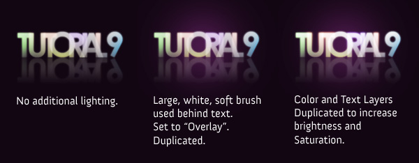
Playing with additional blurs can also add a bit of liveliness to the text. Try Duplicating a layer, and applying a motion blur to see how that works out for you!

Feel free to grab the PSD if you’re having any trouble!
You can leave a response, or trackback from your own site.

 Download Psd File
0 Response to "Colorful Glowing Text Effect in Photoshop ( Tutorial & Psd File )"
Enregistrer un commentaire